- Back to Home »
- Rushkoff: Apple iOS7 follows the leader

- Douglas Rushkoff: Apple's new iOS represents incremental step into future
- He says new design is right for a digital world; it doesn't rely on icons of physical world
- Apple is following Microsoft in making this change in approach, Rushkoff says
- Rushkoff: Apple lost ability it had under Steve Jobs to force users to follow its lead
Editor's note: Douglas Rushkoff writes a regular column for CNN.com. He is a media theorist and the author of the new book "Present Shock: When Everything Happens Now."
(CNN) -- A few million iPhone users woke up to a new operating system this week, the much-heralded iOS 7, the biggest change in Apple's smartphone operating system since the phone was first released in 2007.
It's a different look and feel, for sure. But for those who may fear having to learn some whole new way of using a phone, rest assured: Not much has been fundamentally altered. It's still very much the same operating system you've made a part of your life.
That's really the news here: Apple is taking its users one baby step toward the next mobile platform. And while it may indicate something about where Apple hopes to bring smartphone interfaces in the future, this incremental step may say more about Apple's diminishing ability to make changes in our computing lives by decree.

Back in the Steve Jobs era, Apple could force its dedicated user base to go anywhere Steven told them. The original, VW Bug-inspired iMac was the first major desktop that did not offer a floppy drive. Users grumbled and panicked, but they did as Steven told them, and now we live in a world where many readers don't even know what a floppy drive is.
Then Steve took away serial ports, and so on, continually forcing new changes on Apple users for their own good. Consumers even lined up to purchase the iPad on Steve's command; they didn't have any real need for the thing but trusted that Steve knew best. The ongoing success of the tablet seems to suggest that he did.
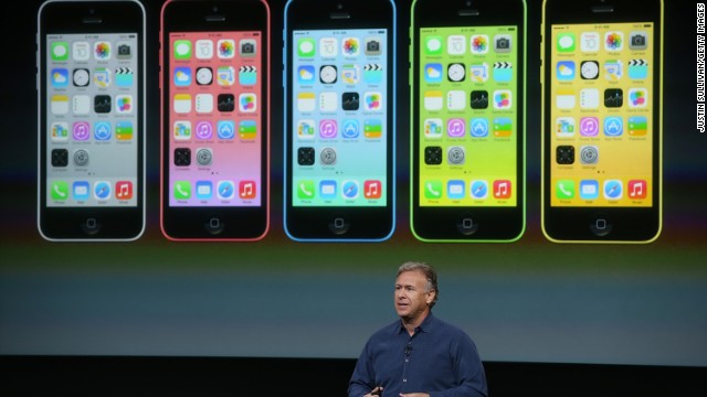
Apple's new operating system doesn't ask users to make such a leap of faith. Yes, the new iOS is brighter and more colorful and the icons are simpler and less three-dimensional. It looks like a new phone. And the fonts are more streamlined and communicative.
Instead of using lines to separate things, font shapes and sizes are used more effectively to delineate items in lists -- making everything a bit more airy. Most significantly, the "things" depicted in the new OS look less like things. There are no little binders drawn on notebooks, no details on buttons, no leatherette address book and no shadows behind pages.
 Apple fanatics line up for new iPhones
  Apple decline: What would Steve Jobs do?
 If anything, Apple is weaning us off the metaphorical desktop, trying to bring us into a virtual universe where we no longer depend on the familiar anchors of the "real" world to relate effectively to our applications.
On a smartphone, an address book is not really an address book, after all. It's an application that lets us search through data about our contacts. A notepad is not a pad with paper; it is a way of saving text. While the real world metaphors initially helped us understand what all these things were for, apps needn't be bound by the limits of real world devices. For the computing world to develop further, it needs to be freed of the obligation to do everything in ways that reflect real world processes.
Perhaps surprisingly, Microsoft already accomplished this last year. With nothing to lose, the company worked with Nokia to develop a smartphone and tablet operating system called Metro that no longer has a desktop, as we traditionally think of it.
Instead of depicting icons against a background, Metro breaks the screen up into tiles that deliver live feeds of whatever is happening in the apps. Streams of tweets, incoming e-mails or changing weather all flow from their tiles in real time.
Meanwhile, the apps themselves, once opened, have almost no lines or grids in them at all. The incoming e-mail list (there's no in "box" anymore) is broken up with space, not lines. Everything is accomplished with innovative font selection and sizing.
Microsoft's operating system represents the future of computing. It was also a market failure, at least in the short run. That's because Microsoft doesn't have the power or charisma to demand that users follow it into the unknown. People followed Steve Jobs because they believed in his vision -- even if they didn't know what it was. Microsoft doesn't enjoy that benefit of the doubt.
But today, without Jobs, neither does Apple. That's why -- instead of dragging us kicking and screaming into the future Microsoft has already developed -- Apple is trying to lead us there one easy step at a time.
Follow us @CNNOpinion on Twitter .
Join us at Facebook/CNNOpinion .
The opinions expressed in this commentary are solely those of Douglas Rushkoff.


